5 Design Mistakes That Can Ruin Your Estate Agent Board (And How to Avoid Them)
Posted on by Matt Roscoe
-znQMx8ZqX3.jpeg)
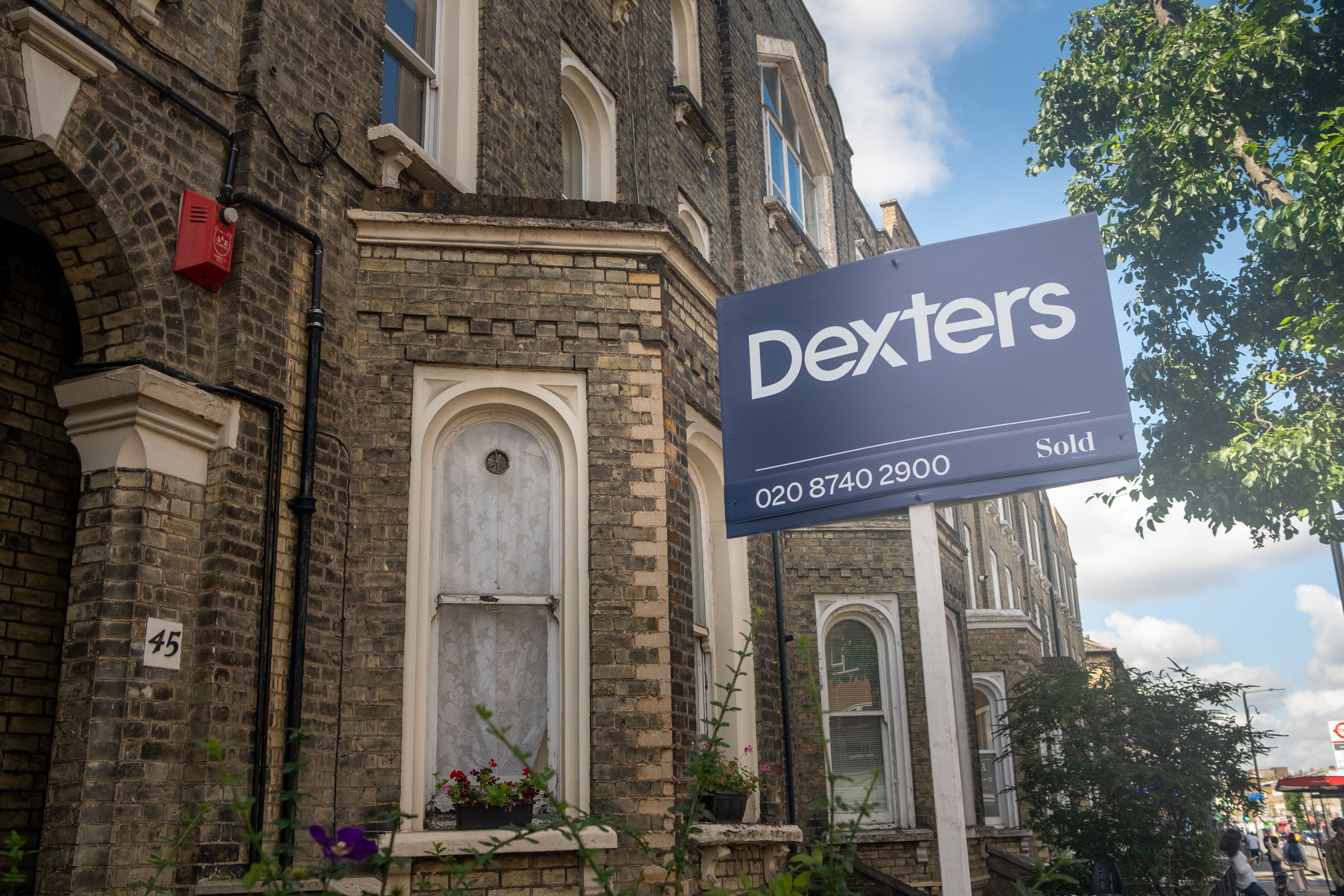
If you’re running an estate agency, your estate agent board is often the first thing potential buyers or renters notice about a property. But even the most professional signage can fail if the design isn’t right. Here, we’ll cover the most common mistakes in estate agent board advertising and provide tips on how to design an estate agent board that attracts attention and drives results for your business.
Get your high-quality estate agent boards today with Carrick Signs
Estate Agent Signage Mistakes to Avoid
1. Overcrowding the Board with Information
One of the biggest mistakes in estate agent sign design is trying to include too much text or imagery. Too many words, logos, or small print make it hard for passers-by to read your board quickly.
How to avoid it:
Keep messaging short and clear
Highlight only the most important information, such as “For Sale” or “To Let”
Use bold fonts for the agency name and contact number
A clean, uncluttered estate agent sign is far more effective for estate agent board advertising than a crowded one.
2. Choosing the Wrong Colours
Colour choice can make or break your estate agent board advertising. Poor contrast or colours that blend into the background reduce visibility.
How to avoid it:
Use high-contrast colours for text and background
Stick to your brand colours, but ensure the sign is easy to read
Avoid neon or overly bright combinations that can distract
A well-chosen colour scheme enhances your estate agent sign design and draws attention to your listing.
3. Using Small Fonts
No matter how attractive your estate agent board is, if people can’t read it from the street, it fails its purpose. Small fonts make it difficult for drivers and pedestrians to take in the information.
How to avoid it:
Use large, bold fonts for key details
Limit the use of different font styles to keep the board easy to read
Test your design from a distance before printing
Readable text is crucial when it comes to designing an estate agent board effectively.
Get started on your estate agent sign design today.
4. Ignoring Board Placement
Even the best estate agent sign can fail if it’s positioned poorly. Placing a board where it’s partially hidden or facing the wrong direction reduces its impact.
How to avoid it:
Ensure your board is clearly visible from main roads or footpaths
Position it at eye level for pedestrians and drivers
Check local council regulations for permitted placements
Strategic placement is an essential part of estate agent board advertising success.
5. Forgetting Your Brand
A common mistake in estate agent sign design is neglecting consistent branding. If your board doesn’t clearly display your agency’s logo or colours, it won’t reinforce your business identity and promote brand awareness.
How to avoid it:
Include your logo and contact information prominently
Use a consistent font choice, colours, and design elements across all boards
Ensure the board aligns with your overall marketing materials
A strong brand presence on your estate agent board builds trust and recognition with potential clients.
Does your signage need an upgrade? Contact our experts here.
Turn Your Estate Agent Board into a Powerful Marketing Tool
A great estate agent sign design is only effective when paired with the right materials and formats. That’s why we offer a range of professional signage specifications to support your estate agent board advertising and ensure your boards look great and last longer.
Our most popular options include:
4mm Correx® T Boards – 813mm x 610mm
Ideal for post-mounted signage, making it easy to add your own fixings.
6mm Correx® Flag Boards – 813mm x 610mm
A premium option with added rigidity, perfect for wall-mounted or flag-style estate agent signs.
4mm Correx® Slips – 813mm x 152mm or less
Great for “Sold”, “Let” or “Under Offer” messaging to update your boards quickly and cost-effectively.
We also offer bespoke sizes and custom shapes, giving you complete flexibility in how to design an estate agent board that suits your brand, your properties, and your marketing goals.
By combining strong visuals with the right specifications, your estate agent sign won’t just look professional; it will work harder for your business.
Get Your Estate Agent Board Design Right the First Time With Carrick Signs
Avoiding these design mistakes is key to creating an effective estate agent sign. By keeping your board clean, readable, visually appealing, and on-brand, you can make the most of your estate agent board advertising efforts.
If you’re unsure how to design an estate agent board, consider working with a professional signage company to ensure your property stands out and attracts the right attention.
You can call, email or fill in a contact form here.